

UX/UI Design
App Design
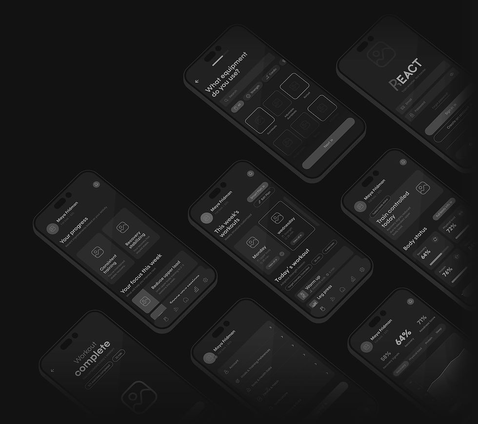
REACT
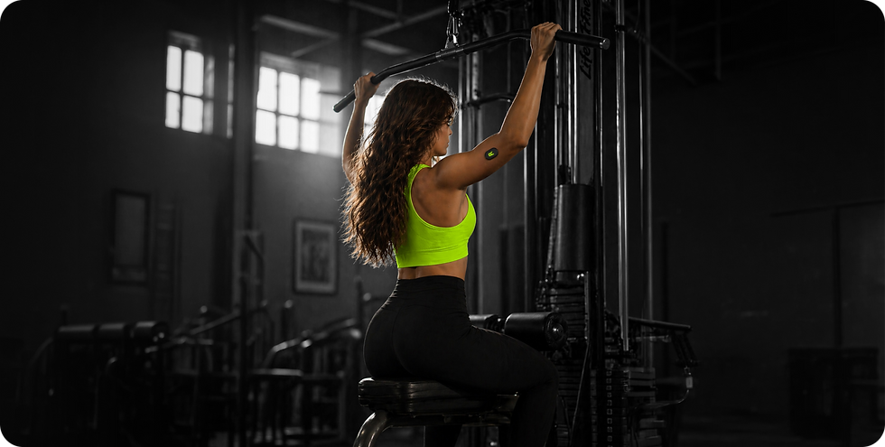
REACT is a digital system that combines
a smart body patch with a mobile app.
By connecting a physical device with a digital interface, the app presents data in a simple way, helping users better understand their body across training, recovery, and nutrition.
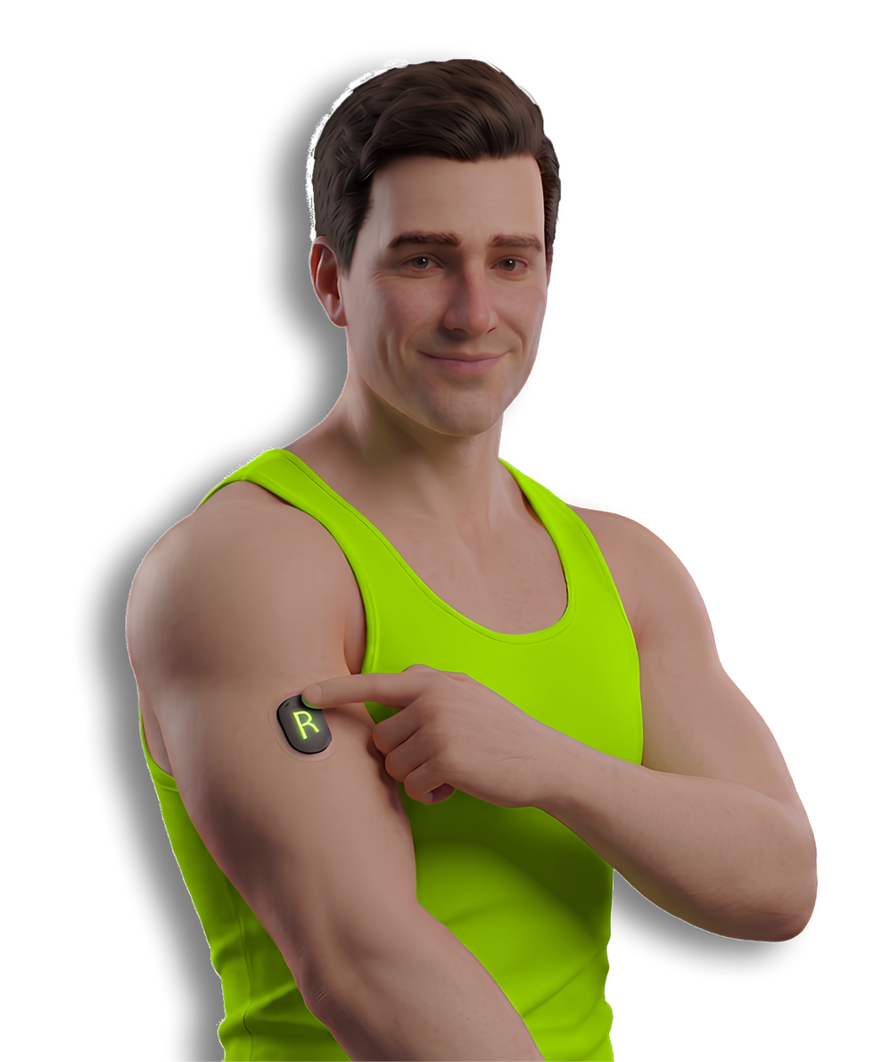


It supports users throughout their training routine, providing a clear, continuous view of their body’s condition.

Trainees invest time and effort into workouts but struggle to understand how their body actually responds.
THE PROBLEM
Without clear feedback, it’s difficult to know when to push forward, adjust intensity, or support progress through recovery and nutrition.
As a result, many rely on guesswork, leading to frustration and inconsistency.
This helps users make better decisions, stay consistent, train with confidence, and better understand their overall physical condition.
THE SOLUTION
The app provides a simple way to understand how the body responds to training over time.
Using a smart patch, it tracks key metrics and turns complex data into clear and actionable insights.


Tap a pain point to reveal the solution
PAIN POINTS & SOLUTIONS
Users struggle to understand how their body responds to workouts and what training suits their current condition.

Energy levels fluctuate, and sleep data doesn’t clearly reflect overall recovery.
Nutrition is tracked in a general way, without clear insight into its effect on performance and recovery.
It’s hard to know if fatigue is normal or a sign of overload, and when the body is truly ready to train again.

Ux Design
Ux Design
Ui Design
App Design
REACT
REACT is a digital system that combines a smart body patch with a mobile app. It supports users throughout their training routine, providing a clear, continuous view of their body’s condition.
By connecting a physical device with a digital interface, the app presents data in a simple way, helping users better understand their body across training, recovery, and nutrition.


Trainees invest time and effort into workouts but struggle to understand how their body actually responds.
Without clear feedback, it’s difficult to know when to push forward, adjust intensity, or support progress through recovery and nutrition.
THE PROBLEM
THE SOLUTION
The app provides a simple way to understand how the body responds to training over time.
As a result, many rely on guesswork, leading to frustration and inconsistency.
Using a smart patch, it tracks key metrics and turns complex data into clear and actionable insights.
This helps users make better decisions, stay consistent, train with confidence, and better understand their overall physical condition.

It’s hard to know if fatigue is normal or a sign of overload, and when the body is truly ready to train again.

The app tracks load, recovery, and readiness to guide smarter training decisions.
Nutrition is tracked in a general way, without clear insight into its effect on performance and recovery.
The app connects nutrition data to real performance in a simple and clear way.
Energy levels fluctuate, and sleep data doesn’t clearly reflect overall recovery.
The app tracks sleep quality and energy levels to give a complete recovery picture.
PAIN POINTS & SOLUTIONS
The app analyzes body response and provides clear, personalized training recommendations.
Users struggle to understand how their body responds to workouts and what training suits their current condition.

Prefer simple insights over complex data.
80
%
Trained ineffectively without knowing what to change.
Report having little or unclear information.
Rely on general feelings rather than clear data.
65

%
USER RESEARCH
%
83
%
71
The research shows that users experience uncertainty and lack of clarity regarding how training affects their bodies.
They make decisions based on general feelings and assumptions, which can lead to overload or lack of progress.
There is a clear need for a system that provides a real-time, accurate, and accessible understanding of the body’s condition, and translates it into simple, actionable recommendations.
Rely on general feelings rather than clear data.
65
%
USER RESEARCH
Report having little or unclear information.
80
%
Trained ineffectively without knowing what to change.
%
83
Prefer simple insights over complex data.
%
71
The research shows that users experience uncertainty and lack of clarity regarding how training affects their bodies.
There is a clear need for a system that provides a real-time, accurate, and accessible understanding of the body’s condition, and translates it into simple, actionable recommendations.
They make decisions based on general feelings and assumptions, which can lead to overload or lack of progress.


The setup flow functions as a decision layer, collecting essential inputs like goals, equipment, and routine.
By grounding recommendations in real user context, the app delivers relevant and personalized training from the start.
SMART SETUP
DEVICE PAIRING
The setup experience is designed to be fast and frictionless.
Bluetooth scanning provides real time feedback, while clear visual guidance shows how to place and connect the device, ensuring a smooth and confident start.
USER PERSONA

Ethan Miller, 24
Beginner, trains 3–4x/week
Goals
See visible progress in a short time
Understand which workouts actually work
Build a consistent routine
How the app helps
Provides clear feedback on workout effectiveness
Shows how the body responds to different training types
Helps build confidence and consistency through simple insights
Frustrations
Can’t tell if training is effective
Relies on trial and error
Gets discouraged from inconsistent results
Emily Carter, 38
Active lifestyle, trains 2–3x/week
Goals
Maintain a healthy and consistent routine
Avoid fatigue and overtraining
Stay energized throughout the day
How the app helps
Tracks recovery and daily readiness
Helps balance training intensity with rest
Provides personalized insights without overwhelming data
Frustrations
Unsure if intensity and recovery are balanced
Afraid of pushing too hard
Feels apps are too generic and not personalized


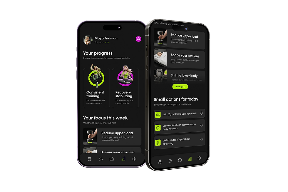
TODAY’S SCREEN
A high-level overview designed for immediate clarity.
All key data points are summarized into one screen, allowing users to quickly understand their current condition and receive clear guidance on how to train and act today.

A quick indicator of the body’s readiness, helping guide training intensity decisions.


A simplified training recommendation that translates complex data into a clear action for today.


Practical recommendations that support better results based on current needs.
COMPETITOR RESEARCH


WORKOUT SCREEN
A structured view of the user’s training plan, combining smart adaptation with full visibility.
The screen allows users to understand, adjust, and execute their workout with clarity and control.
A direct entry point into the workout flow, allowing users to begin immediately with minimal friction.


The workout plan updates dynamically based on recovery, activity, and progress, ensuring training stays aligned with the user’s current condition.

A clear overview of upcoming sessions, helping users stay consistent and understand their weekly training flow.


INFORMATION ARCHITECTURE


BODY INSIGHTS
The screen helps users understand how their body is responding to training, and what it means for performance.
A deeper layer of understanding that translates body data into clear, actionable insights.

Each category isolates a specific aspect of the body, making complex data easier to explore and understand.

Key recovery metrics are visualized over time, allowing users to track changes and identify patterns in their physical state.


GREEN
#AEEC02
PURPLE
#C911C3
I built the visual language around a high contrast system that keeps the experience clear focused and action driven. A dark base combined with neon accents highlights key actions and important data and pushes the user toward the next step.
Instead of presenting raw data I focused on translating information into clear insights and actions so users can quickly understand what to do next and move forward without overthinking.
VISUAL LANGUAGE
WHITE
#FCFAFA
BLACK
#161616


VISUAL LANGUAGE
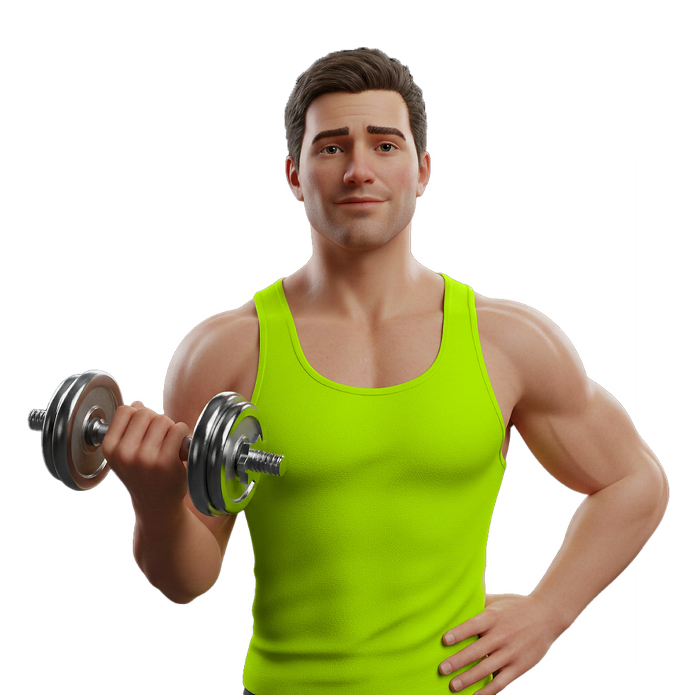
I chose a stylized 3D character system instead of realistic visuals to avoid body comparison and reduce self judgment, creating a safer and more motivating experience focused on progress rather than appearance.


UI KIT

PROGRESS SCREEN
This screen translates ongoing activity into clear progress and future direction.
It highlights what is improving, what to focus on next, and how to maintain consistency over time.
A prioritized set of recommendations designed to guide the user toward meaningful improvement.
Key achievements are surfaced to reinforce consistency and make progress visible over time.


Simple, low effort actions that support recovery and keep users engaged in small, consistent steps.


Rely on general feelings rather than clear data.
Report having little or unclear information.
Rely on general feelings rather than clear data.
Report having little or unclear information.
65
%
%
80
83
%
USER RESEARCH
71
%
The research shows that users experience uncertainty and lack of clarity regarding how training affects their bodies.
There is a clear need for a system that provides a real-time, accurate, and accessible understanding of the body’s condition, and translates it into simple, actionable recommendations.
They make decisions based on general feelings and assumptions, which can lead to overload or lack of progress.

The setup flow functions as a decision layer, collecting essential inputs like goals, equipment, and routine.
By grounding recommendations in real user context, the app delivers relevant and personalized training from the start.
SMART SETUP
DEVICE PAIRING
The setup experience is designed to be fast and frictionless.
Bluetooth scanning provides real time feedback, while clear visual guidance shows how to place and connect the device, ensuring a smooth and confident start.
USER PERSONA

Ethan Miller, 24
Beginner, trains 3–4x/week
See visible progress in a short time
Understand which workouts actually work
Build a consistent routine
Goals
Relies on trial and error
Gets discouraged from inconsistent results
Can’t tell if training is effective
Frustrations
Provides clear feedback on workout effectiveness
Shows how the body responds to different training types
Helps build confidence and consistency through simple insights
How the app helps

Avoid fatigue and overtraining
Stay energized throughout the day
Emily Carter, 38
Beginner, trains 3–4x/week
Maintain a healthy and consistent routine
Goals
Unsure if intensity and recovery are balanced
Frustrations
Tracks recovery and daily readiness
Helps balance training intensity with rest
Helps build confidence and consistency through simple insights
How the app helps
Afraid of pushing too hard
Feels apps are too generic and not personalized
TODAY’S SCREEN
A high-level overview designed for immediate clarity.
All key data points are summarized into one screen, allowing users to quickly understand their current condition and receive clear guidance on how to train and act today.
A simplified training recommendation that translates complex data into a clear action for today.
A quick indicator of the body’s readiness, helping guide training intensity decisions.


Practical recommendations that support better results based on current needs.

COMPETITOR RESEARCH

WORKOUT SCREEN
A structured view of the user’s training plan, combining smart adaptation with full visibility.
The screen allows users to understand, adjust, and execute their workout with clarity and control.

A clear overview of upcoming sessions, helping users stay consistent and understand their weekly training flow.

The workout plan updates dynamically based on recovery, activity, and progress, ensuring training stays aligned with the user’s current condition.

A direct entry point into the workout flow, allowing users to begin immediately with minimal friction.


INFORMATION ARCHITECTURE

BODY INSIGHTS
A deeper layer of understanding that translates body data into clear, actionable insights.
The screen helps users understand how their body is responding to training, and what it means for performance.
Each category isolates a specific aspect of the body, making complex data easier to explore and understand.

Key recovery metrics are visualized over time, allowing users to track changes and identify patterns in their physical state.


PURPLE
#C911C3
BLACK
#161616
WHITE
#FCFAFA
GREEN
#AEEC02
BRIGHT PURPLE
#A44BF1
DARK PURPLE
#39155F
I built the visual language around a high contrast system that keeps the experience clear focused and action driven. A dark base combined with neon accents highlights key actions and important data and pushes the user toward the next step.
VISUAL LANGUAGE
BLACK
#0A0A0A
WHITE
#FCFAFA
Instead of presenting raw data I focused on translating information into clear insights and actions so users can quickly understand what to do next and move forward without overthinking.


I chose a stylized 3D character system instead of realistic visuals to avoid body comparison and reduce self judgment, creating a safer and more motivating experience focused on progress rather than appearance.
ILLUSTRATION STYLE

UI KIT


A prioritized set of recommendations designed to guide the user toward meaningful improvement.
PROGRESS SCREEN
It highlights what is improving, what to focus on next, and how to maintain consistency over time.
This screen translates ongoing activity into clear progress and future direction.
Key achievements are surfaced to reinforce consistency and make progress visible over time.

Simple, low effort actions that support recovery and keep users engaged in small, consistent steps.


